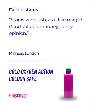
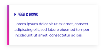


The design files I received were not a cohesive system, but the product of two creative agencies engaged consecutively, without coordination between them. The brand library was fragmented throughout: for example, the primary brand color alone existed in approximately fifty variations, and secondary and supporting colors showed similar inconsistency across the files. Components intended to serve identical functions were also designed inconsistently across the site, and layouts for comparable page types followed no shared logic. No accessibility review had been conducted against WCAG 2.1 AA. Most critically, the files lacked a defined information architecture: they amounted to loose layout proposals, disconnected from the site's actual structure and any coherent user journey.
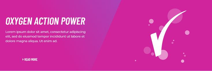
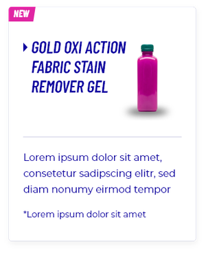
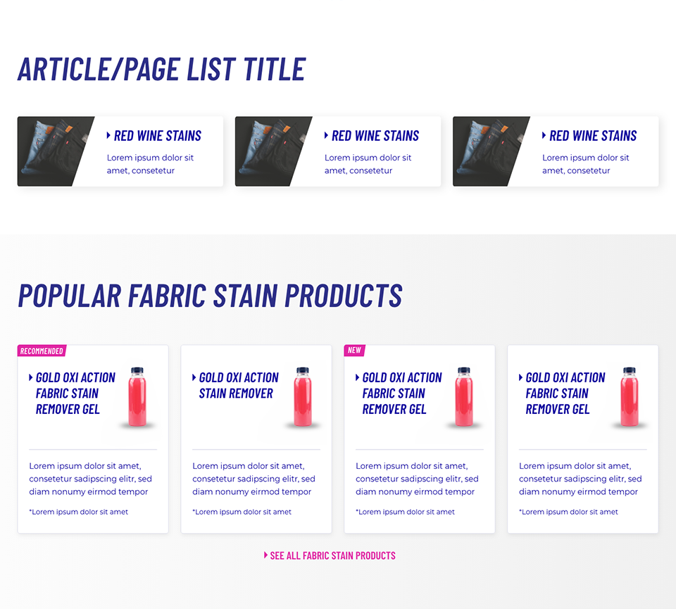
In close collaboration with the brand team, I consolidated the color system from roughly fifty shades to five or six definitive colors, and formally defined accompanying gradients and typography, all built to WCAG 2.1 AA from the outset. I then reconciled the two agencies' divergent component proposals, approximately forty overlapping or redundant pieces, into a single, consistent library, assessing each for technical feasibility within our framework and rebuilding any that failed accessibility requirements.
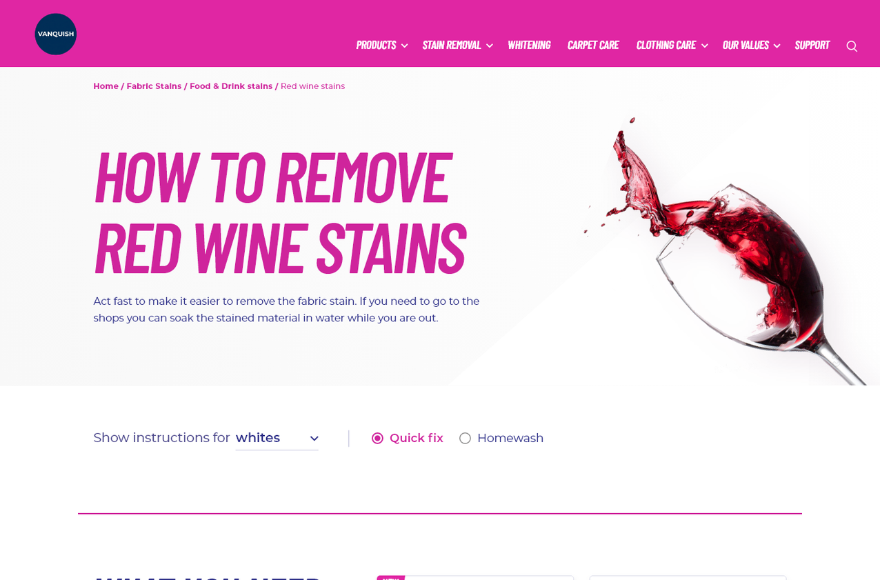
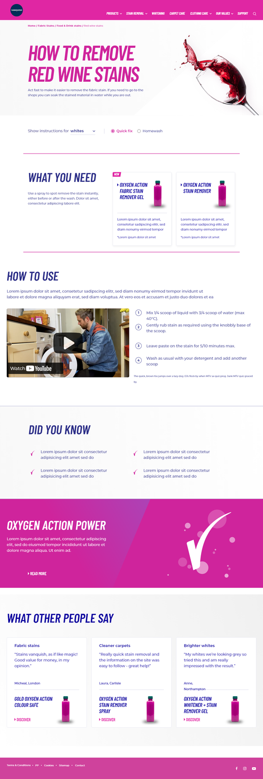
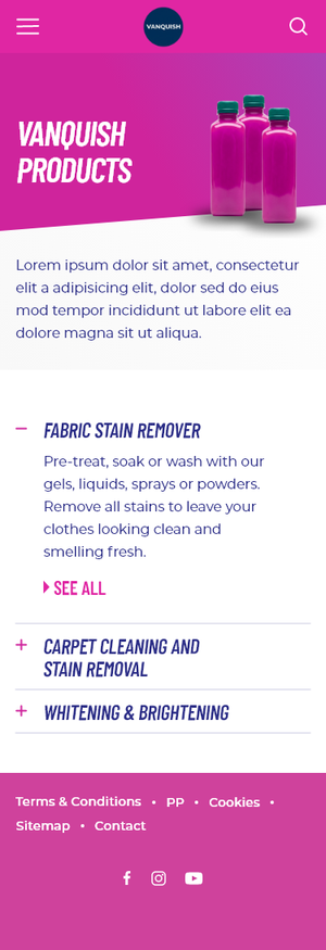
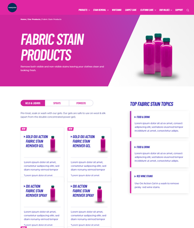
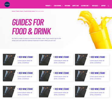
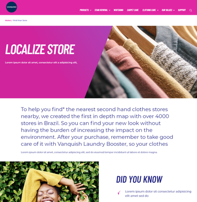
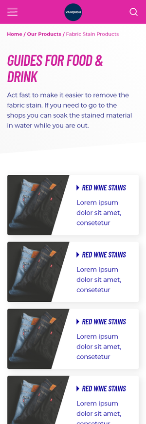
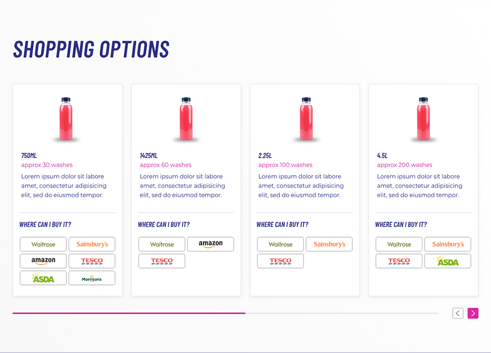
With a unified component library in place, I designed approximately twenty distinct page templates reflecting the site's actual structure and supporting clearly defined user journeys, replacing the disconnected proposals originally provided. All layouts were designed responsively across desktop, tablet, and mobile breakpoints, in line with standard responsive web design principles.
Each design, along with its deployed implementation, was subsequently audited against WCAG 2.1 AA to confirm full compliance prior to release.
All ~20 page templates were designed and audited responsively across desktop, tablet, and mobile.
Reduced the brand color system tenfold, from approximately fifty shades to five or six definitive colors
Elevated accessibility compliance from partial — more than half of components previously failed WCAG standards — to full WCAG 2.1 AA compliance
Delivered approximately twenty reusable, fully responsive page templates and a consolidated library of components, reduced from roughly forty overlapping originals
Established a master template that served as the foundation for Vanquish's website rollout across approximately 70 local markets
Reduced build costs, deployment time, and cross-market inconsistency at scale