
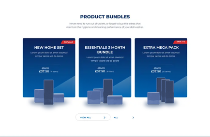
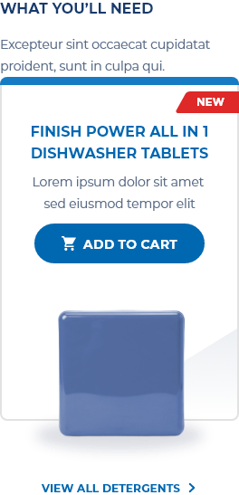
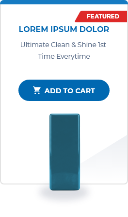
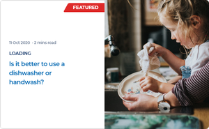
Finishline's offering spanned four distinct product lines, each governed by its own design principles and branding guidelines. A core business goal was to clearly differentiate these lines while maintaining equal perceived value across all of them, avoiding any impression that one line was inferior to another. This needed to be achieved through visual and content strategy alone, communicating each line's unique benefits and enabling unbiased, informed user choice, while simultaneously supporting a strong e-commerce conversion path from product exploration to purchase.
Leading a UX team of three designers from the earliest stages, I worked closely with brand and content teams to rework the site's information architecture, foregrounding key product benefits while simplifying navigation and content flow. The breadth of the product offering required designing approximately 50 unique, fully responsive page layouts (desktop, tablet, and mobile) sufficient to address each product line's distinct presentation needs without breaking consistency across the site. WCAG 2.1 AA compliance was treated as foundational throughout, alongside continuous attention to usability and technical feasibility along the site's core discovery-inform-buy journey.
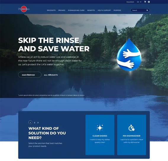
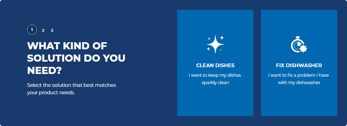
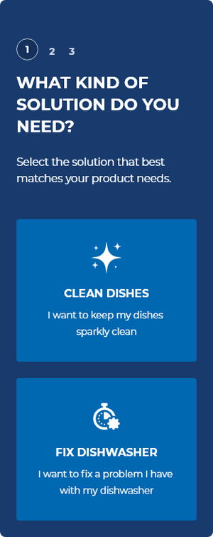
To directly support unbiased product line differentiation, we introduced a new product advisor quiz, offering tailored recommendations based on individual user needs, building on a similar concept developed for D-brand, here adapted to guide users toward the most suitable product line rather than a specific product.
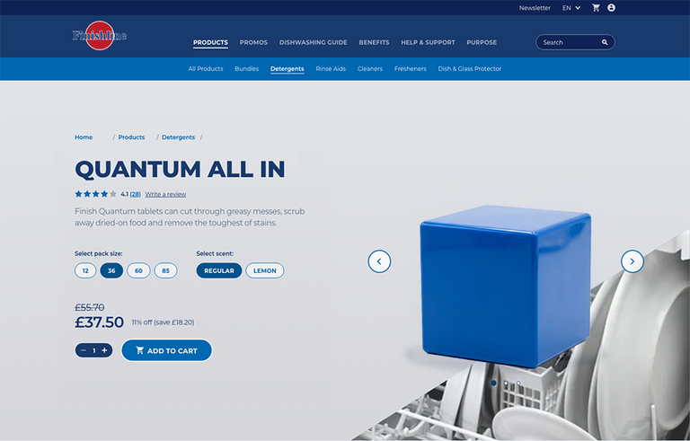
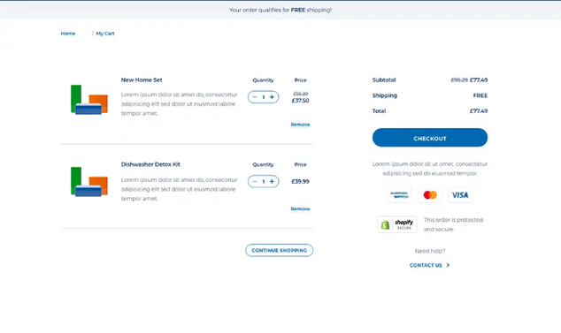
In parallel, the team enhanced e-commerce functionality: optimized product pages, clearer calls to action, and integration with retail partners to support conversion across regional markets.
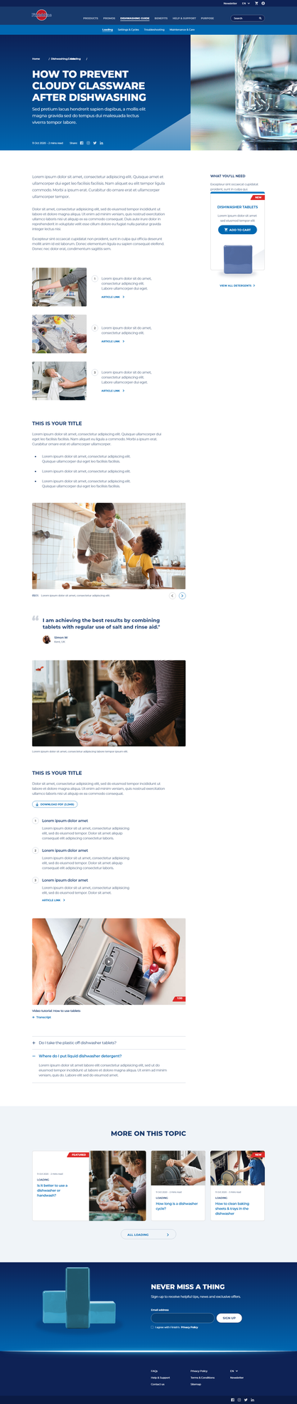
All ~50 unique page layouts, across all four product lines, were designed responsively for desktop, tablet, and mobile.
Delivered approximately 50 unique, responsive page layouts, accommodating four distinct product line identities within a single coherent system
Established a master template used to revamp 35–40 local market websites
Achieved full WCAG 2.1 AA compliance across all layouts and user journeys
Introduced a tailored product advisor quiz supporting unbiased, needs-based product line discovery
Strengthened e-commerce functionality and retail partner integration to support conversion across regional markets
Led a team of three designers through a complex, multi-line redesign requiring close brand and content coordination