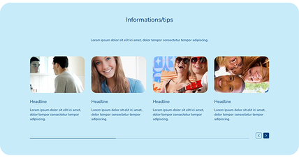
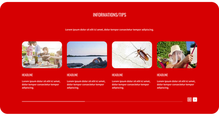
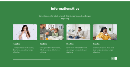
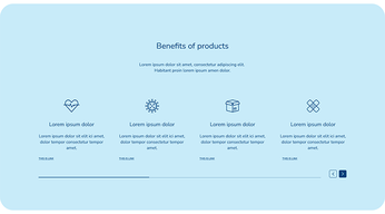

The company operates dozens of brands across more than 200 markets, spanning categories as different as home cleaning products and infant nutrition. Historically, these brands had no shared technical or design foundation: websites were built on a patchwork of platforms, including AEM, Shopify, Umbraco, WordPress, and several proprietary stack variants. This fragmentation made every website expensive to build, slow to deploy, and inconsistent in quality, accessibility, and brand execution.
HuskyX was conceived as the answer: a single, universal framework combining a Contentstack headless CMS with Gatsby on the backend, paired with a genuinely multi-brand, tokenized Design System built in Figma and Token Studio. The mandate behind it became the team's defining goal: 50% cheaper, twice as fast.
I led the design side of this initiative for two and a half years, as Design Manager overseeing both the Design System itself and the team that built it.
I worked at the intersection of leadership and hands-on design.
On one side, I was responsible for design KPIs, team management, roadmap planning with the Product Owner, and coordination with Migration and Web Excellence teams and external agencies supporting migration at scale.
On the other, I was an active designer within the system itself, directly involved in shaping components, structuring our Figma architecture, and resolving the countless detailed decisions that determine whether a design system actually holds together at scale. I was also one of three cross-functional team members driving the framework's development end-to-end, and I led research, stakeholder consultations, and workshops with brand owners throughout.
This dual role mattered: building a system meant to serve 200+ brands, including 7 Power Brands, across 80+ markets required both top-down architecture and the kind of granular, in-the-weeds design judgment that only comes from being personally involved in the work.
Designing one system to serve brands as different as mosquito repellents and baby formula, washing powders and condoms, meant finding genuine common ground without flattening what made each brand distinct. The system had to be:
Comprehensive enough to support radically different product categories and brand identities
Flexible enough to remain feasible and future-proof as needs evolved
Rigorous enough to meet accessibility and usability standards as a baseline, not an afterthought
Economical enough to credibly deliver on the cost and speed targets driving the entire initiative
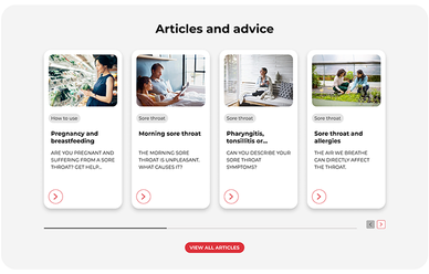
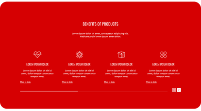
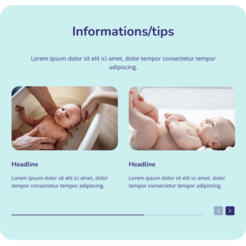
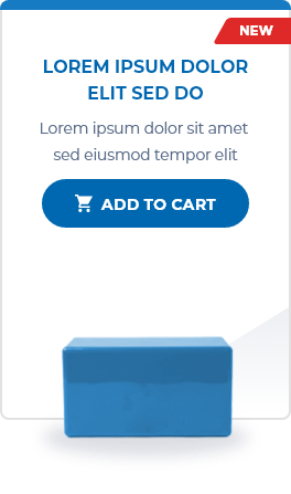
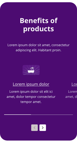
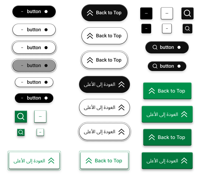
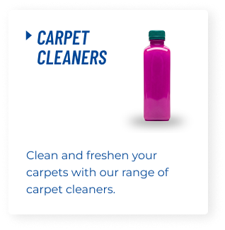
We organized the system into a strict hierarchy: foundational Components (Icon, Typography, Button), Blocks (Date Picker, Product Card, Quantity Selector), Sections (composed rows such as Footers or Product Page Headers), and full Page Templates. This hierarchy made the system scalable and tokenizable, and meant any designer could compose a compliant, on-brand page by assembling pre-built pieces, with no need for individual design verification.
Through sustained advocacy, I successfully convinced the company to adopt WCAG 2.2 AA as its global accessibility standard across all digital products, a standard that has remained in place organization-wide for several years since. I ensured the Design System's foundation, including all core layouts, was built to fully comply with WCAG 2.2 AA, ADA standards, and usability best practices from inception, and that it supported RTL (right-to-left) layouts for global applicability. As a result, any custom layout built within brand guidelines is WCAG-compliant by default.
Recognizing that brands operated with very different budgets, we structured migration into four tiers: L1 (simplified, non-customizable templates resembling a brand's digital business card), L2 (customizable layouts using predefined components), L3 (L2 plus D2C functionality), and L4 (fully custom websites still built on the underlying system). Every brand received a migration path suited to its budget, while still landing on the same compliant, optimized framework.
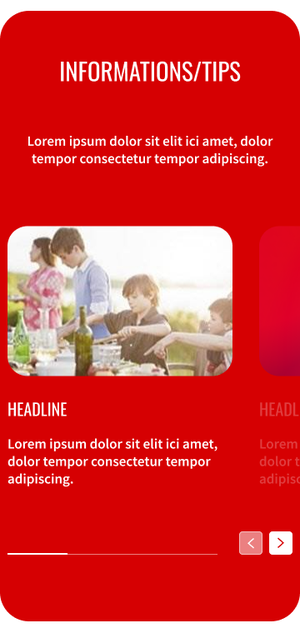
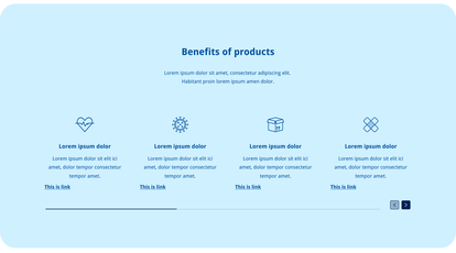
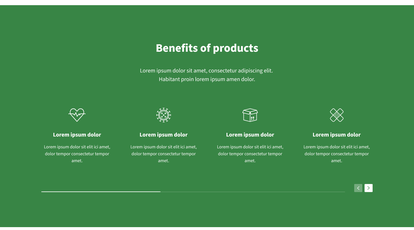
Each component was built to dynamically inherit brand-specific properties — color, typography, spacing, and border radius — controlled at the component-type level rather than per instance, guaranteeing visual consistency without sacrificing flexibility. Components shipped with multiple ready-made variants from the outset, and we built in support for small, controlled CSS overrides where genuinely necessary, balancing brand freedom against system integrity.
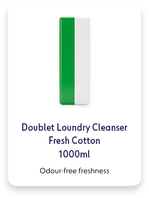
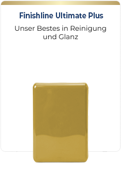
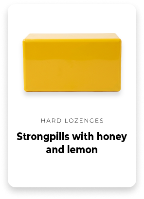
Tokenization was deliberately sequenced after the system's structure and code were fully defined — partly because the system itself needed to mature first, and partly because Figma and Token Studio weren't yet capable of supporting a system of this scale. Once both were ready, we tokenized 58 components into nearly 2,500 interconnected tokens, parsed directly into website CSS, more than 90% automated, with the remainder handled through custom CSS. The result: building a fully custom-branded instance of the system now takes hours rather than days. I personally led consultations with Figma and Token Studio to help shape product features necessary for this to work at our scale, an outcome we believe to be genuinely unique in the industry.
Comprehensive audit of the company's existing websites, identifying shared functional needs and salvageable elements from legacy frameworks, forming the basis of the system's structure.
Strict component definitions established from the ground up, with style relationships defined layer by layer.
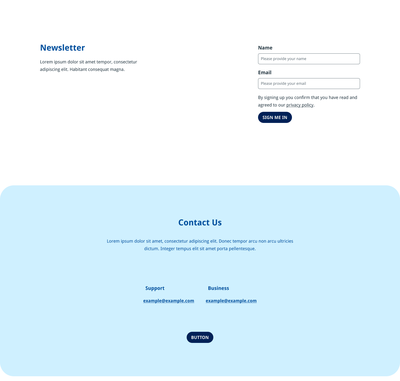
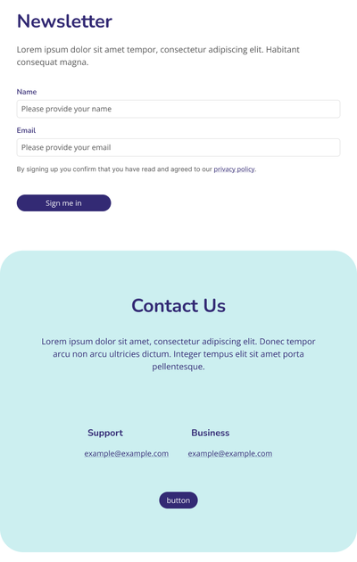
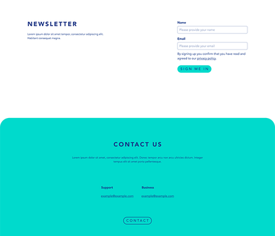
The first adaptable templates, shaped by close analysis of needs, costs, and existing framework limitations.
Following brand consultations and approvals, we built 45+ customized brand layouts to migrate websites off external tech stacks, executed under tight timelines due to subscription and legal constraints.
Feedback from the first migration phase informed new components and variants added to the system.
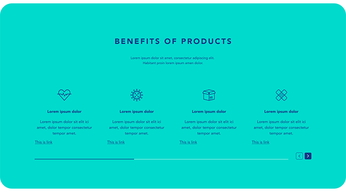
Full sets of unique, market-customizable page layouts, designed as flexible starting points for brand-specific builds.
20 custom-branded layout templates deployed across 80+ markets, scaled with support from external creative agencies. This phase validated how transparent and usable the system had become, while surfacing and resolving remaining functional gaps. It also expanded the system with D2C and user-profile components, even though this migration wave focused primarily on informational sites.
Migration exposed gaps in the system's original documentation. We rebuilt it entirely in Storybook, with structure kept in sync with the Figma workspace.
Once the system and supporting tools matured sufficiently, we completed tokenization: nearly 2,500 tokens across 58 components, giving each brand its own verified, independently workable theme under light central supervision.
Unified dozens of brands previously spread across AEM, Shopify, Umbraco, WordPress, and other platforms onto a single framework
Delivered against the program's founding targets: building pages at roughly 50% lower cost and twice the speed of prior approaches
Scaled to support 200+ brands, including 7 Power Brands, across 80+ markets
Drove company-wide adoption of WCAG 2.2 AA as the standard for all digital products, several years on, still in force
Delivered a tokenization system covering 58 components and ~2,500 tokens, over 90% automated from Figma/Token Studio directly into production CSS
Reduced the time to produce a fully custom-branded system instance from days to hours
Directly influenced product development at Figma and Token Studio through consultation, contributing to capabilities that didn't previously exist for systems of this scale