HUSKY-X
Reckitt websites' framework
Husky-X is a framework using Content Stack headless CMS with Gatsby JS as a backbone.
Its’ visual side is genuine, universal Design System built in Figma and Token Studio.
This reflects two and a half years of focused effort by my team and me.


50% Cheaper
Until HuskyX, brands have been using dozens of different technology stacks, like AEM, Starterkit, Shopify, Umbraco or even OneCMS or Wordpress. To reduce cost and to level the tech fragmentation, we have built an universal product to serve all defined needs.
Twice as fast
We created unified delivery and maintenance process for all websites by providing consistent website ecosystem, using component-based design and development flow.
Design standardisation
Our Design system is meant to be comprehensive, to suit needs of over 18 Power Brands and 80 local hero brands on 200+ markets. Brands representing products as different as mosquito repellents and baby formulas, as disparate as washing powders and condoms. We had to examine them all and create common denominator with enough room and flexibility, to keep it feasible and future-proof. To improve ratings and benchmarks, compliance with accessibility and usability standards became our main principle.
My duties in Husky-X project
Close cooperation with Product Owner to define priorities and to plan product development road map.
Overseeing design KPIs, UX team work management.
Cooperation with Migration and Web Excellence Teams. Setting up design and migration processes,
defining priorities and requirements.
Managing external agencies, that aid Stream with scaling up the processes of migration and transition.
Performing research and gathering input from business, conducting consultations and workshops
with stakeholders and brand owners.
Supervising the creation of a globally unique tokenization process for a multi-brand design system.
Designing components, supporting components development, creating documentation.
Main Principles
Set of rules that defined our Work
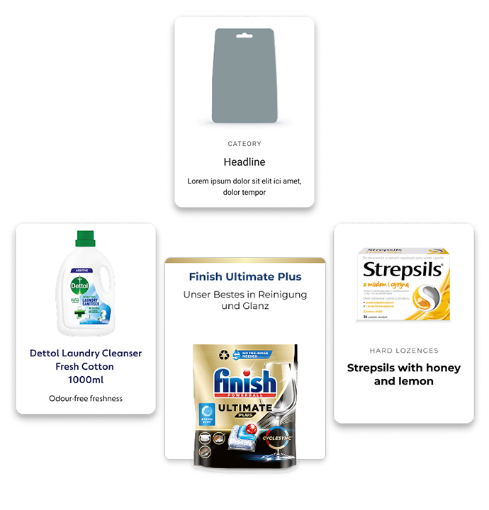
Atomic approach
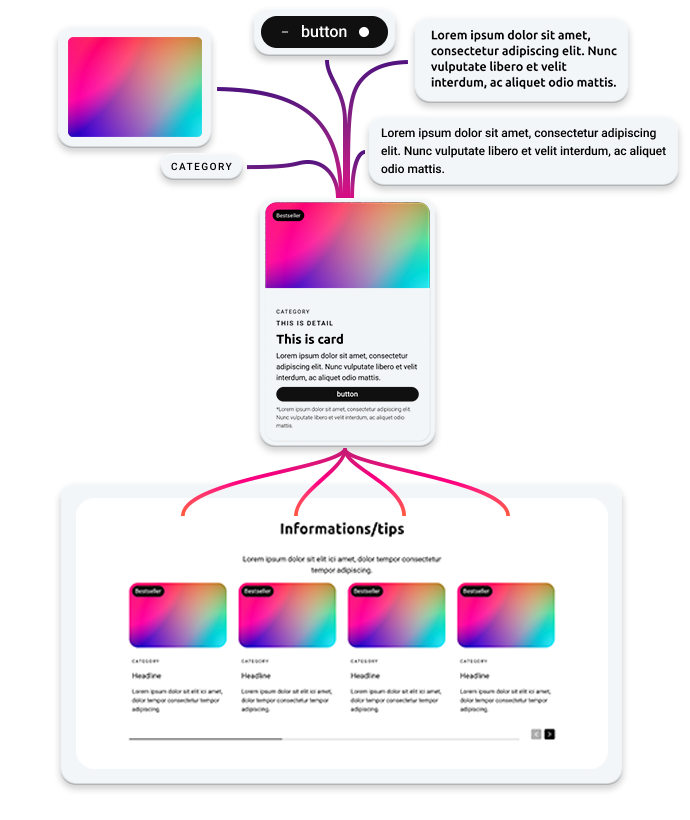
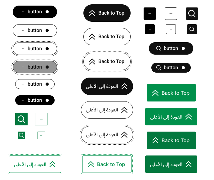
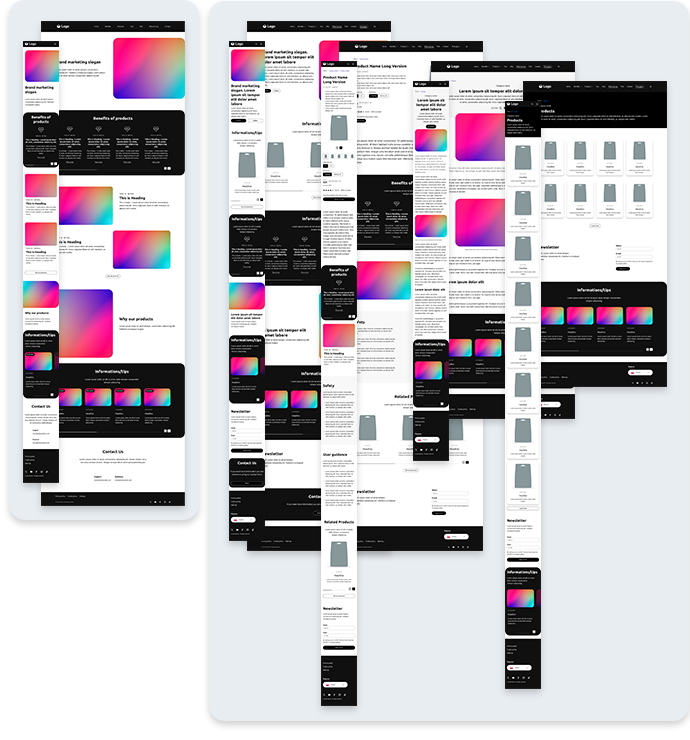
Our design system has been divided into hierarchy of elements. Starting from basic Components like Icon, Typography, Button, etc; through Blocks (more complex ones like Date picker, Product Card, Quantity button) and Sections - rows on layouts composed of Blocks - Footer, Product Page Header; to whole Page layouts and complete Templates. It allowed us construct well organised, scalable structure, feasible to be tokenized.
The ultimate goal was to have product, which allows to build layouts with ease and really fast. After short introduction, any designer may compose websites in simplest way. It is like putting bricks together, layer after layer until desired outcome is obtained. With tokens, the design does not need verification, it is accessible, brand compliant and provides great, standardised user experience.
Accessibility
Thanks to my leadership and continuous advocacy for accessibility, I successfully convinced Reckitt to adopt WCAG 2.2 AA as the global standard for all digital products. For several years now, every website and app within the company has been required to meet these accessibility guidelines. Under my management, I ensured that the foundation of our Design System - including all core layouts - was built to fully comply with WCAG 2.2 AA, ADA standards, and usability best practices from the very beginning. I also made sure it supports RTL (right-to-left) applications, broadening its global applicability. This means that as long as brand guidelines respect accessibility principles, any custom layouts created will be WCAG-compliant by default and consistently achieve high scores in accessibility benchmarks.
Budget tailored approach
As we worked with clients handling different budgets, we had to prepare migration propositions dependant on available assets. Those were divided into four groups:
L1 - simplified templates with no functional customisation, resembling one-pager brand local business card;
L2 - templates with customisable layouts and structure, but using predefined components;
L3 - customisable templates expanded with D2C functionalities; and
L4 - completely customisable websites, yet based on our design system.
As a result, all clients got proposal suitable to their needs and budgets and in the end - migrated to optimised, accessible and compliant framework.
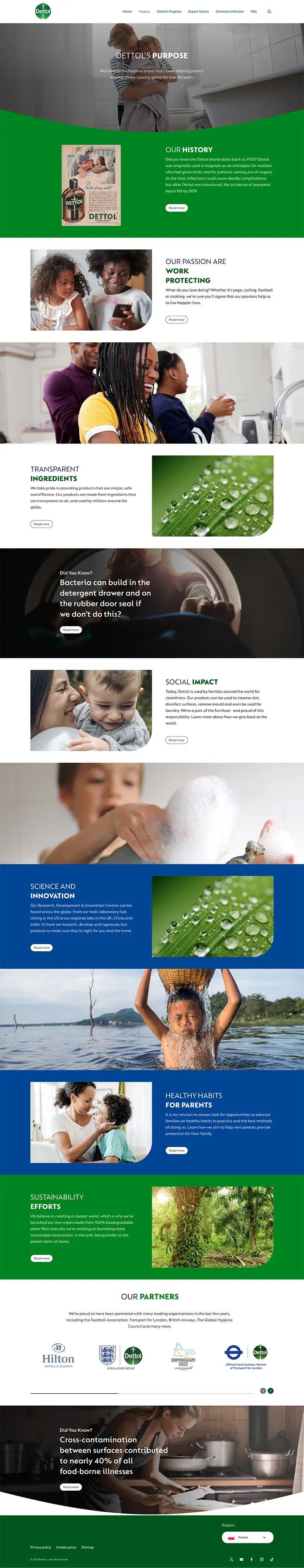
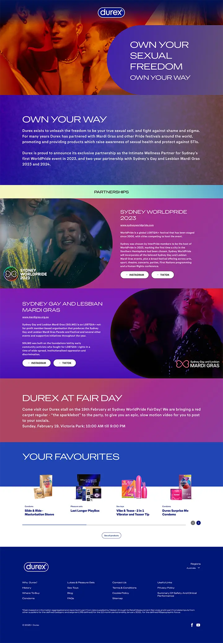
Brand customisation
To ensure every page aligns seamlessly with the client’s brand guidelines, I led the development of the Design System with a core principle of offering “freedom in a box.” Under my direction, each component was designed to dynamically inherit properties such as colors, typography, spacing, and border radius - all controlled at the component type level rather than per entity. This approach guarantees visual consistency across the entire brand template, with tokenization ensuring that design decisions are efficiently translated into code. I also made sure that components provide multiple ready-made variants from the outset, giving teams greater flexibility to meet diverse needs without compromising consistency. . Where necessary, we implemented the option to apply small, controlled CSS overrides within the component content model, striking a balance between flexibility and system integrity.
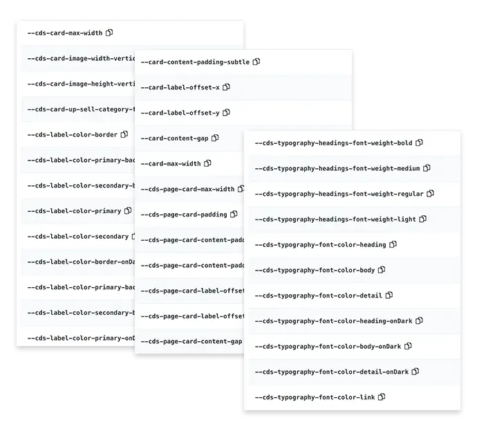
Tokenization
When we completed the first phase of feasibility, I led the team in initiating the tokenization of our Design System. This step had to be postponed to a later stage for two key reasons: first, Design System’s structure and corresponding code had to be fully defined; second, the available technology - specifically Figma and Token Studio - simply wasn’t ready to support such a large-scale, multi-brand system at that time. The tokenization process ultimately covered 58 components and generated nearly 2,500 tokens, all of which are parsed directly into website CSS. Thanks to this approach, building a fully custom-branded design system now takes hours instead of days - and the process is fully automated.
Our tokenization solution is both genuine and globally unique. Under my leadership, we developed the only tokenized Design System capable of supporting dozens of brands within a unified framework, while maintaining flexibility and governance control. It’s designed to be sharable with external partners, ensuring consistency without sacrificing autonomy. I personally led direct consultations with Figma and Token Studio to influence the development of features critical to achieving this capability. As a result, we delivered an industry-leading solution that sets a new standard for scalable, multi-brand design systems.
Husky X design system creation journey
It took us two and half years to build this genuine and unique product. These are milestone we went through.
Research and analysis
Meticulous study of Reckitt's websites. Defining common functionalities, needs of elements and design features.
Creating Design system structure, adopting elements from obsolete frameworks.
Building atomised structure
Creating very strict definitions of components, starting from fundamentals.
Building next layers of design system.
Defining basic style relations between components.
Creating basic templates
After strict analysis of needs, costs, budgets and current framework abilities, we've created an adaptable template for L1 customers.
First migration phase
After consulting brands, sharing principles and collecting approvals, we have prepared 45+ customised brand layouts. They were used to migrated websites' content from external tech stacks to HuskyX framework. It has to be done fast and in set order, due to subscription management and legal issues.
Expanding functionalities
After first phase, we've gathered sizable feedback from brands regarding design and function features. Most vital ones were included in our design system as new components or new component variants.
Building customisable templates
While expanding functionalities of design system, we've created L2 templates. They contained all unique page layouts, meant to be used during building websites of particular brands. By design they all were flexible and customisable per market, however each one was a baseline to give good jumpstart during migration process.
Biggest migration yet...
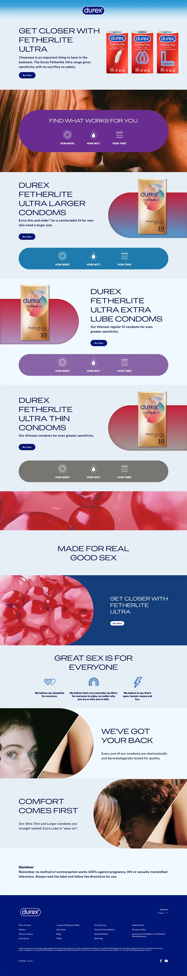
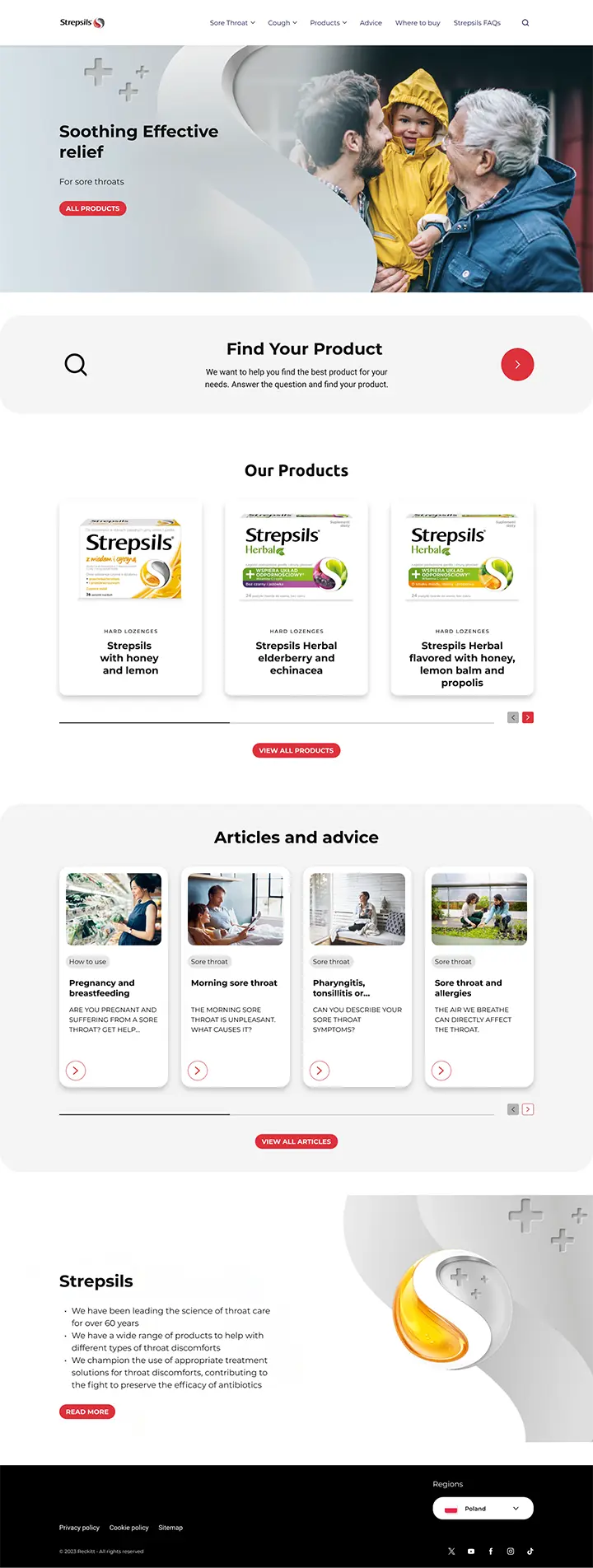
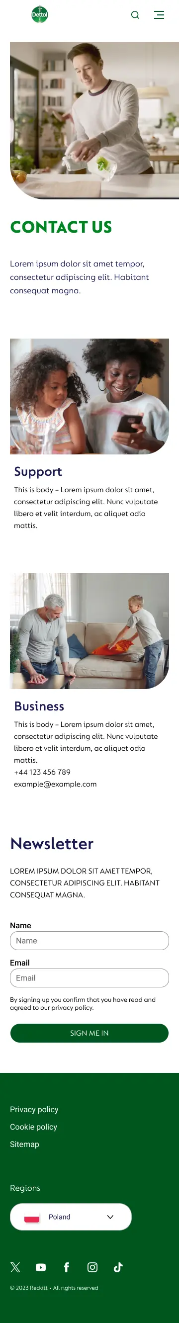
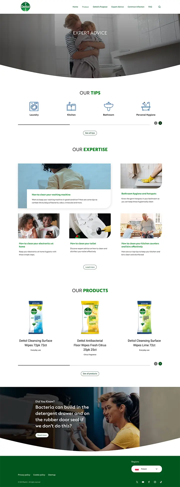
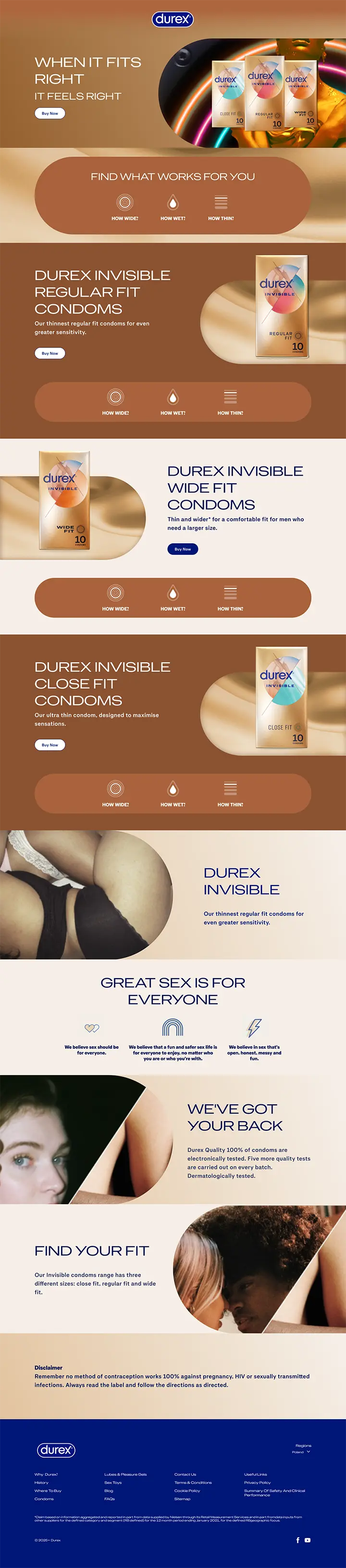
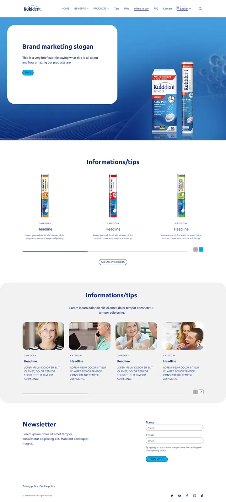
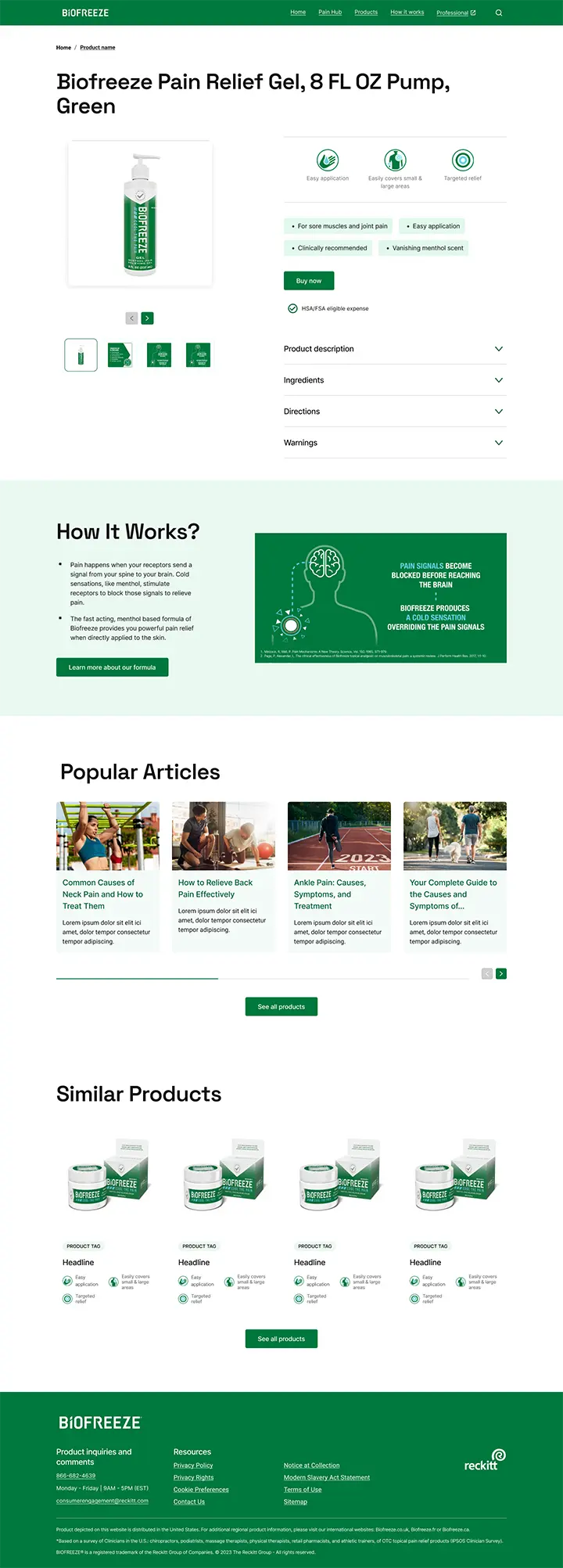
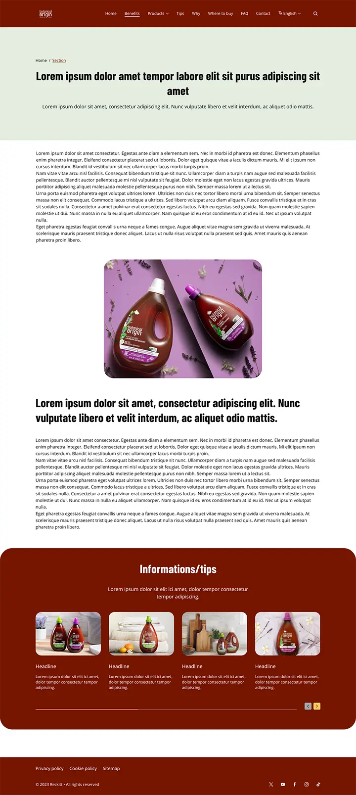
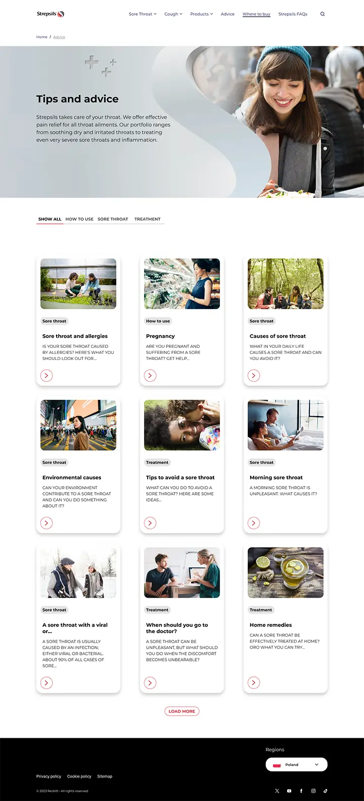
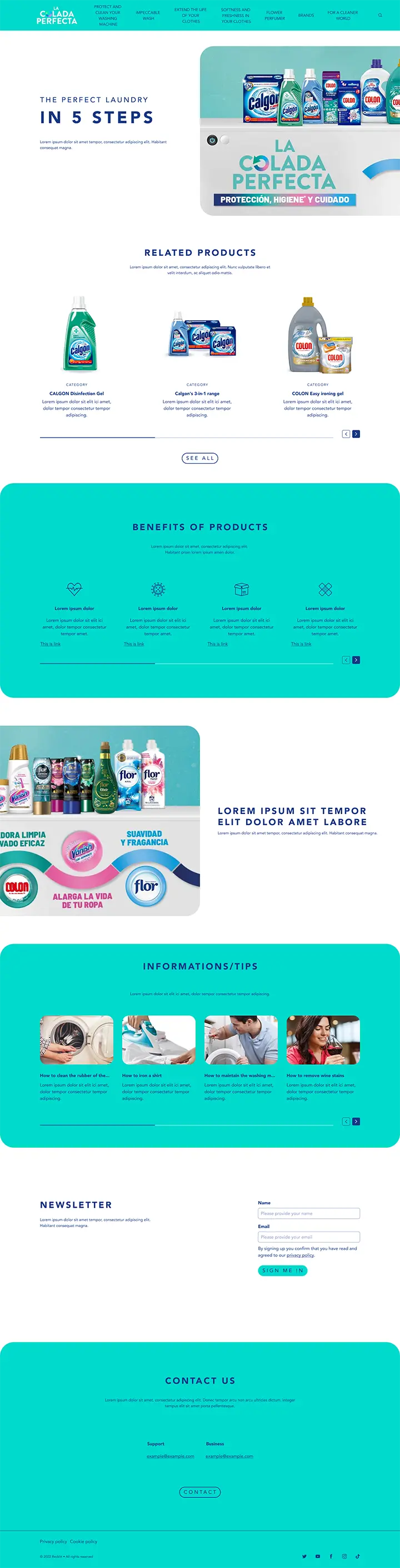
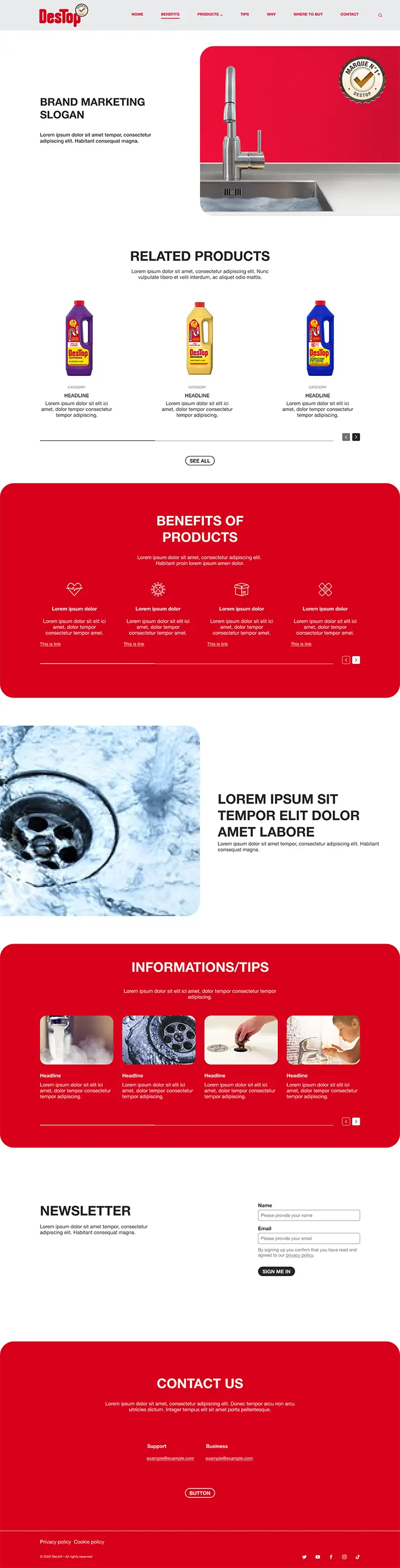
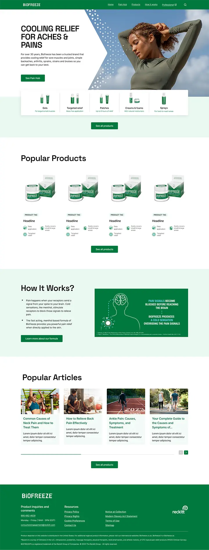
We have created 20 custom branded layout templates to be used on 80+ markets. To obtain this, we have scaled up with external creative agencies. It proved how transparent and easy to use is our design system. During this process we have been filling the functional gaps and fixing discovered issues. All migrations required big number of consultations and alignment with business side to work out optimal procedures and roadmap of this migration. We have also expanded design system with components meant to be used in D2C and User profile operations, although migration focused on informative role of Reckitt's websites.
Documentation
Documentation of the design system has been built from the start of it creation, however migration process created gaps and shown shortcomings. We decided to revisit and improve whole documentation. It was set on StoryBook with new structure, and we assured correspondence with Figma Workspace.
Tokenization
HuskyX design system was meant to be multibrand by principle. We had to postpone process of tokenization until Figma and Token Studio will evolve and expand enough to allow us to achieve it. When it become possible, we have created almost 2500 interconnected tokens defining 58 components. Brand received their own verified themes and were able to work on their own branch with only small supervision from us. The result is accessible, usable and brand compliant. The process is fully automated and more than 90& of styles are parsed to CSS directly from Figma and Token Studio. The rest is custom CSS code.
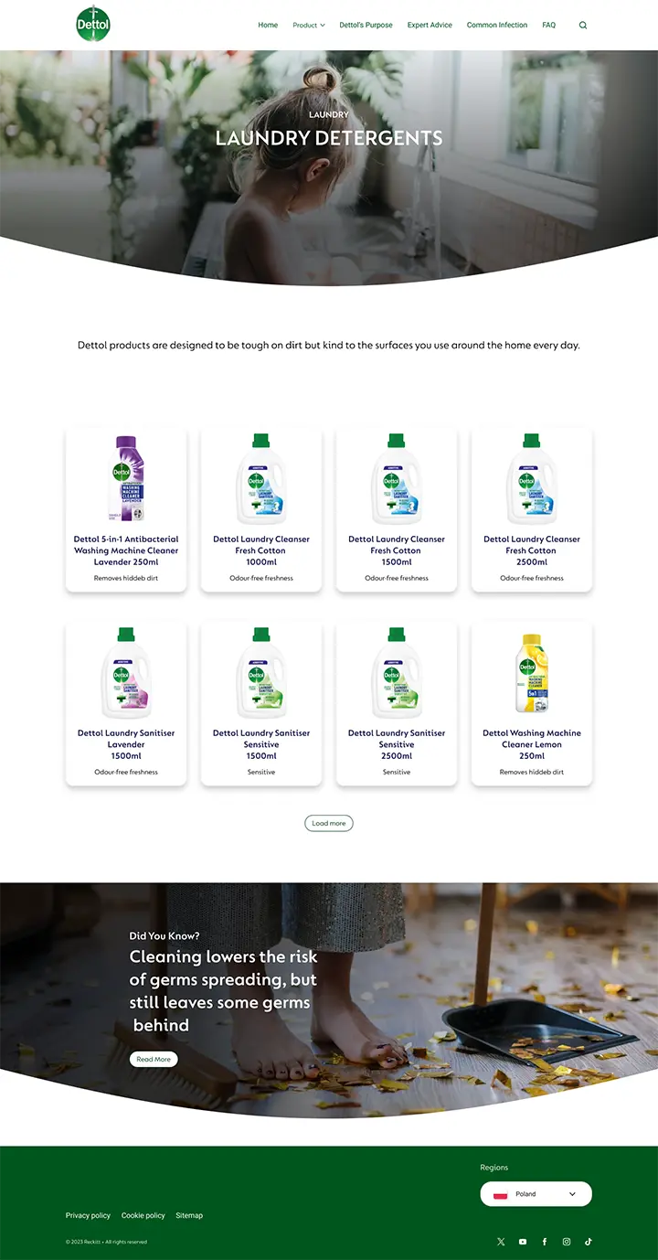
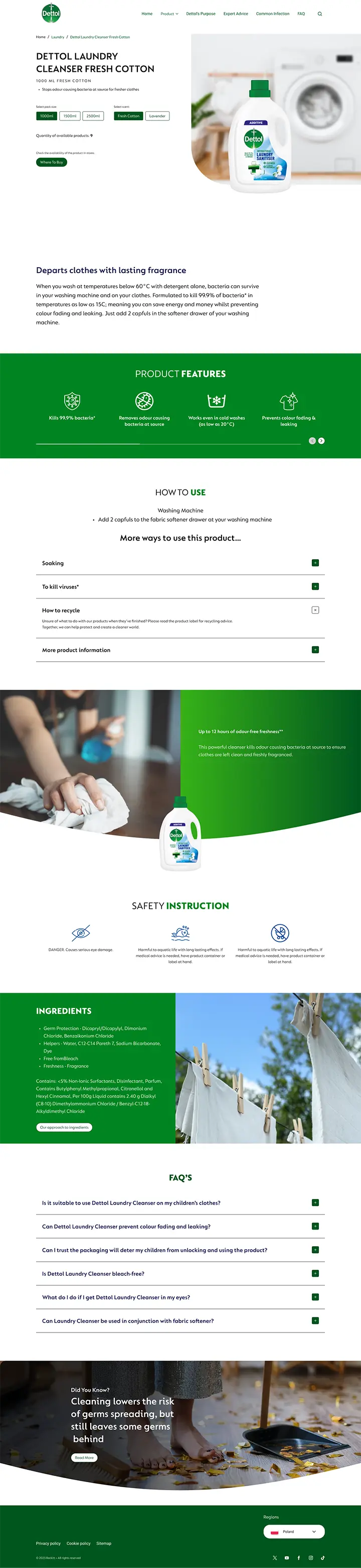
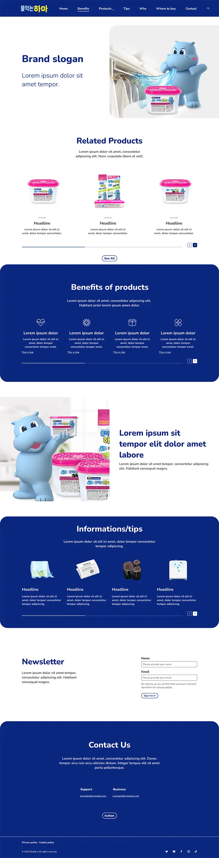
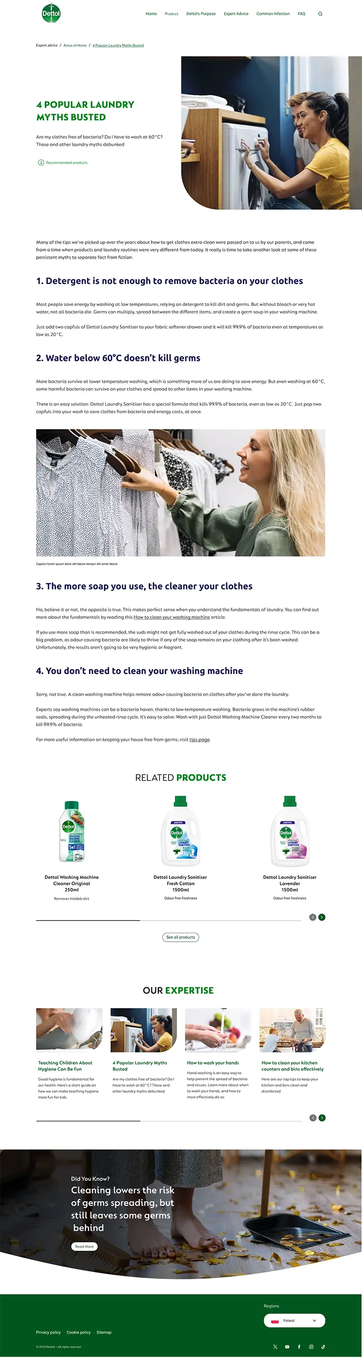
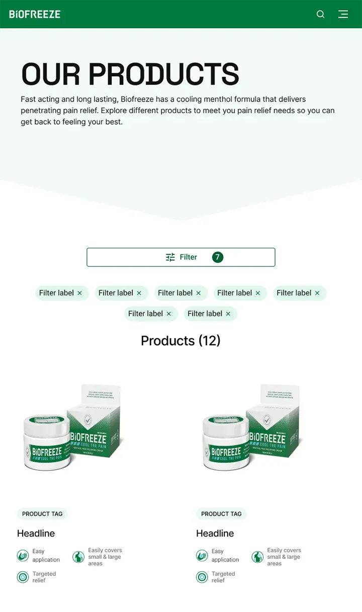
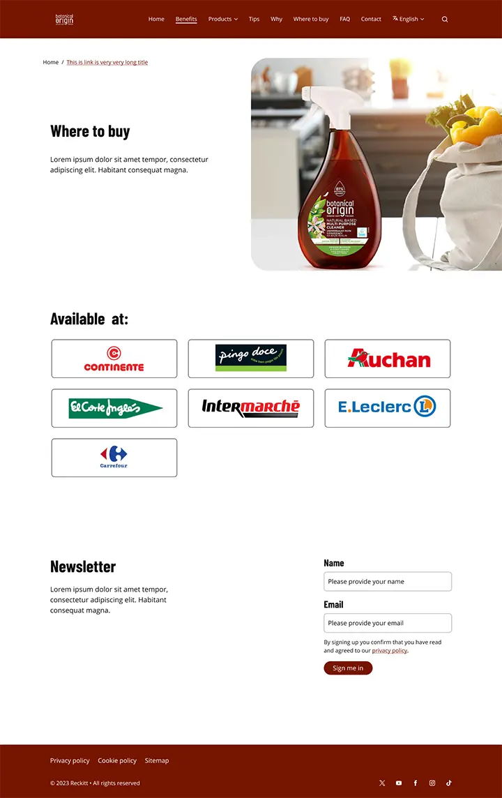
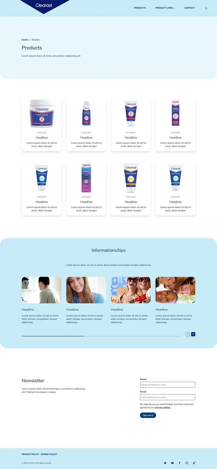
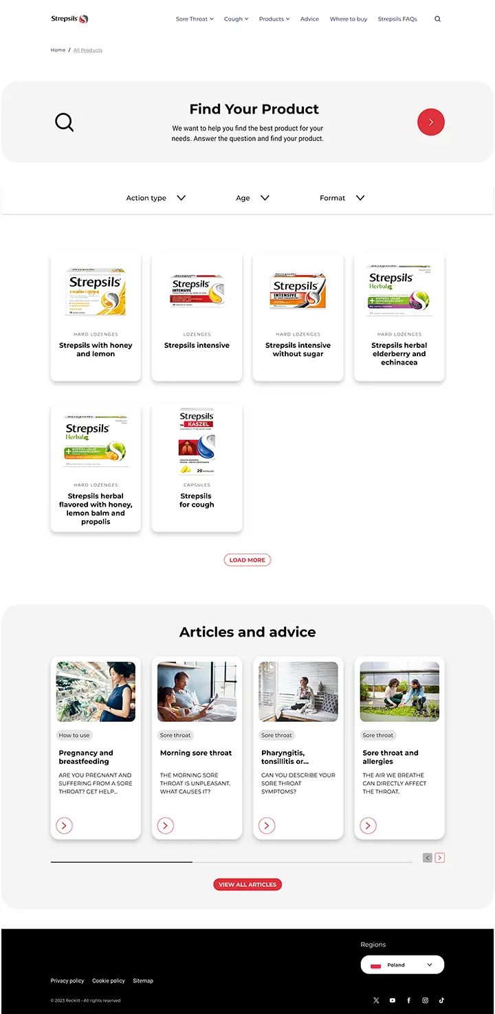
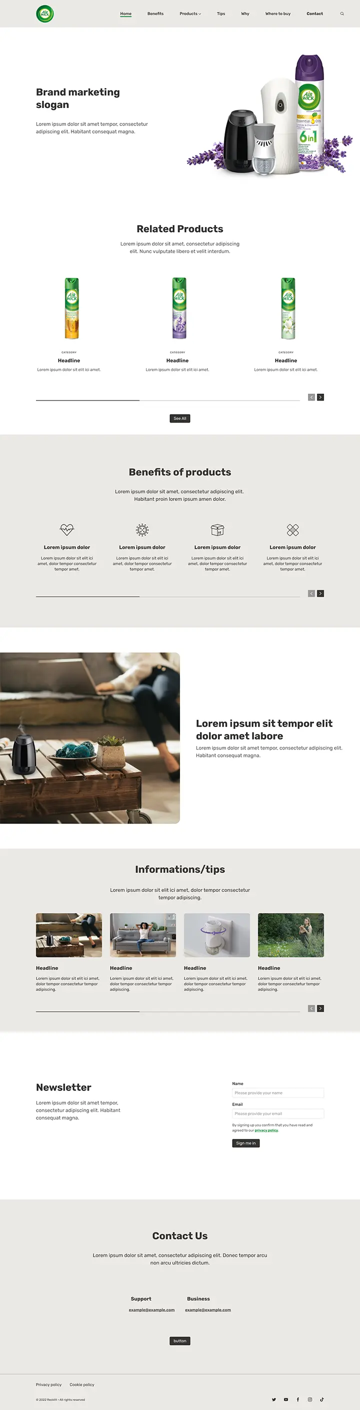
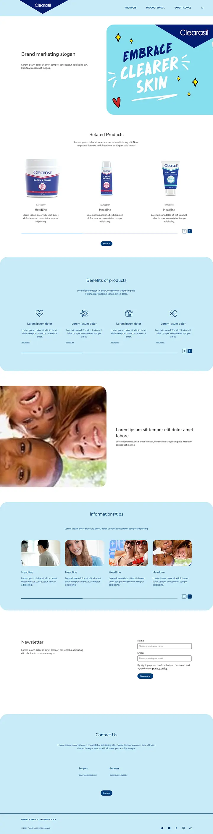
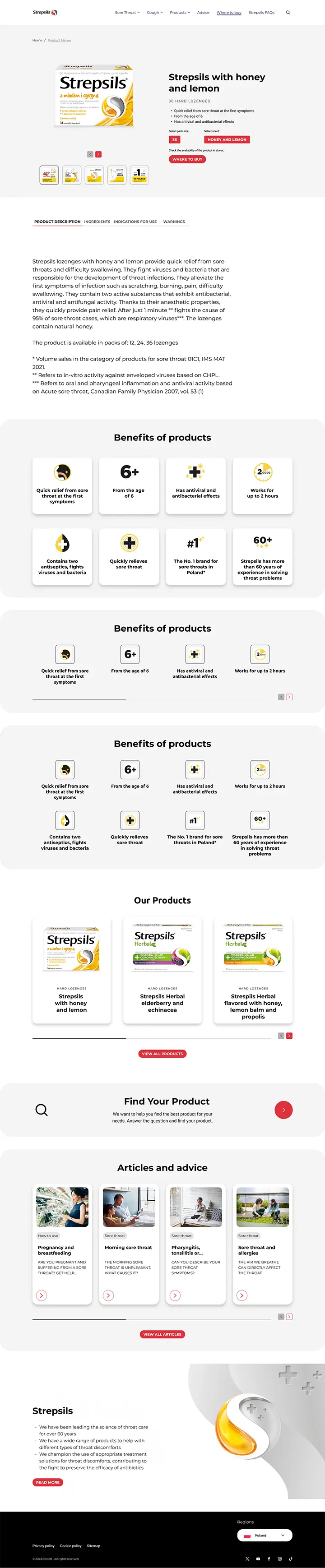
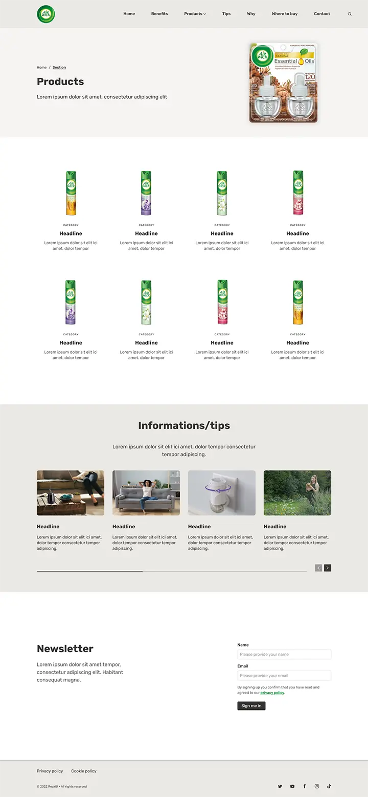
Works
Examples of implementations achieved with our Design System
