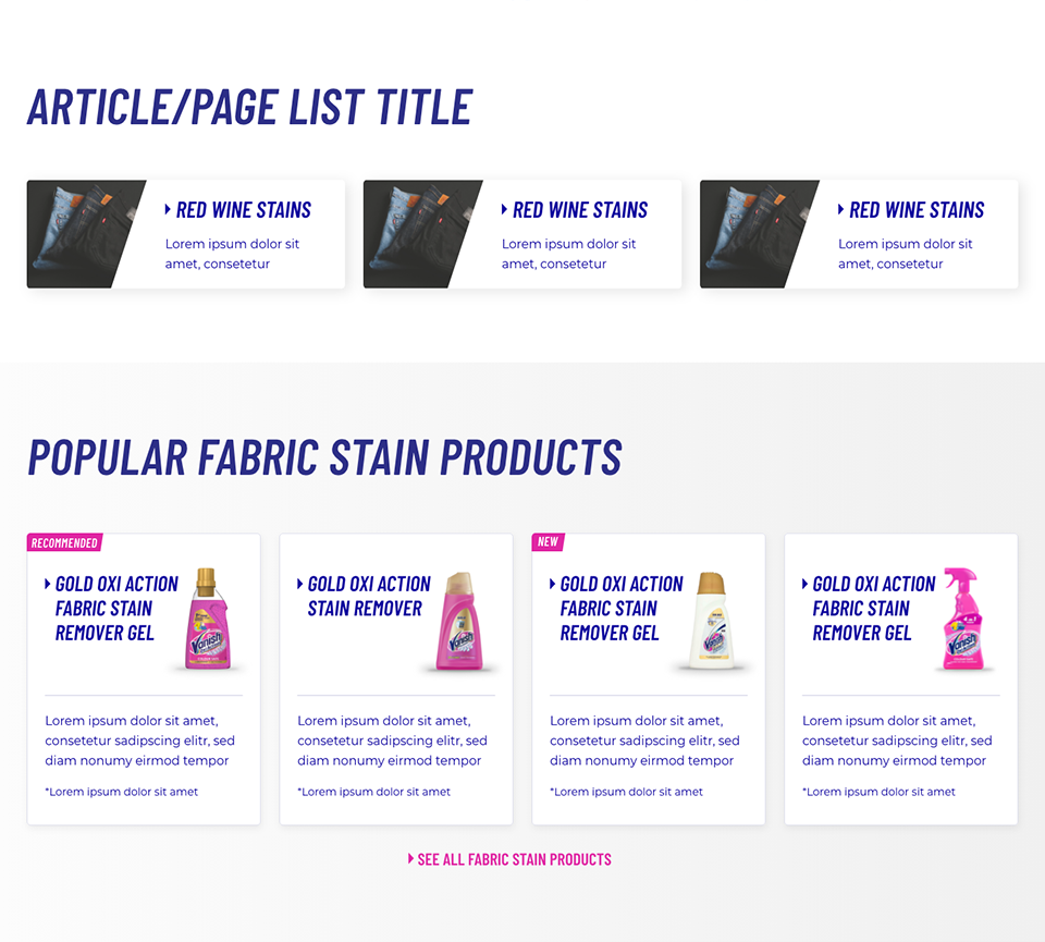
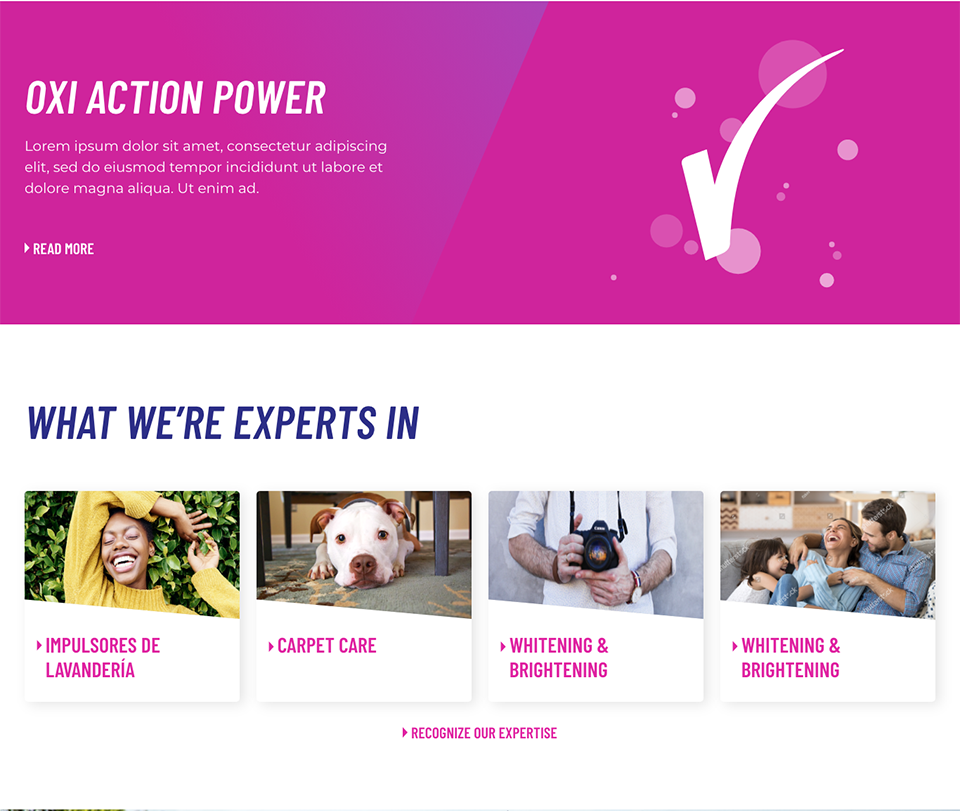
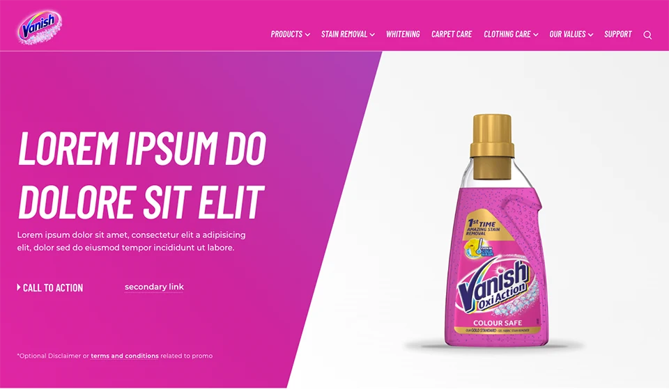
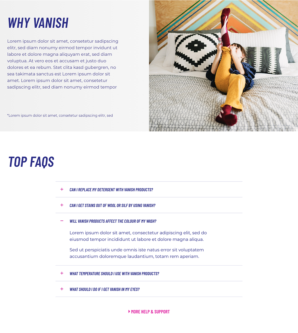
The 2021 rebranding of Vanish presented a unique set of challenges, particularly in the redesign of its websites. One of the primary hurdles was the business team's limited experience with digital products, which required the UX team to play an advisory role throughout the process. Additionally, two different external creative agencies had delivered overlapping yet inconsistent concepts, which needed to be merged and aligned into a single, cohesive digital direction. The brand’s existing digital assets suffered from a cluttered visual identity, including over 20 inconsistent shades of pink and multiple conflicting typefaces, demanding a significant cleanup effort to establish clarity and consistency. Despite these complexities, the UX team worked closely with stakeholders to shape a streamlined and modern design system tailored for digital environments.
Throughout the process, the page structure and information architecture underwent several iterations, reflecting the evolving understanding of both user needs and business goals. The UX team maintained flexibility while ensuring each redesign step improved usability and brand coherence.
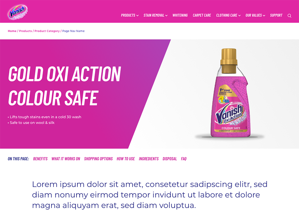
Accessibility was another key focus area, with the UX team taking the lead in educating business stakeholders on its value—not only from a compliance standpoint but as a driver of better user experience and broader reach. By embedding accessibility principles early on, the team helped shift the organization’s mindset toward more inclusive design practices. Ultimately, the redesigned Vanish websites emerged as a cleaner, more user-friendly, and future-ready platform that reflected the refreshed brand with clarity and confidence.